The Big Picture
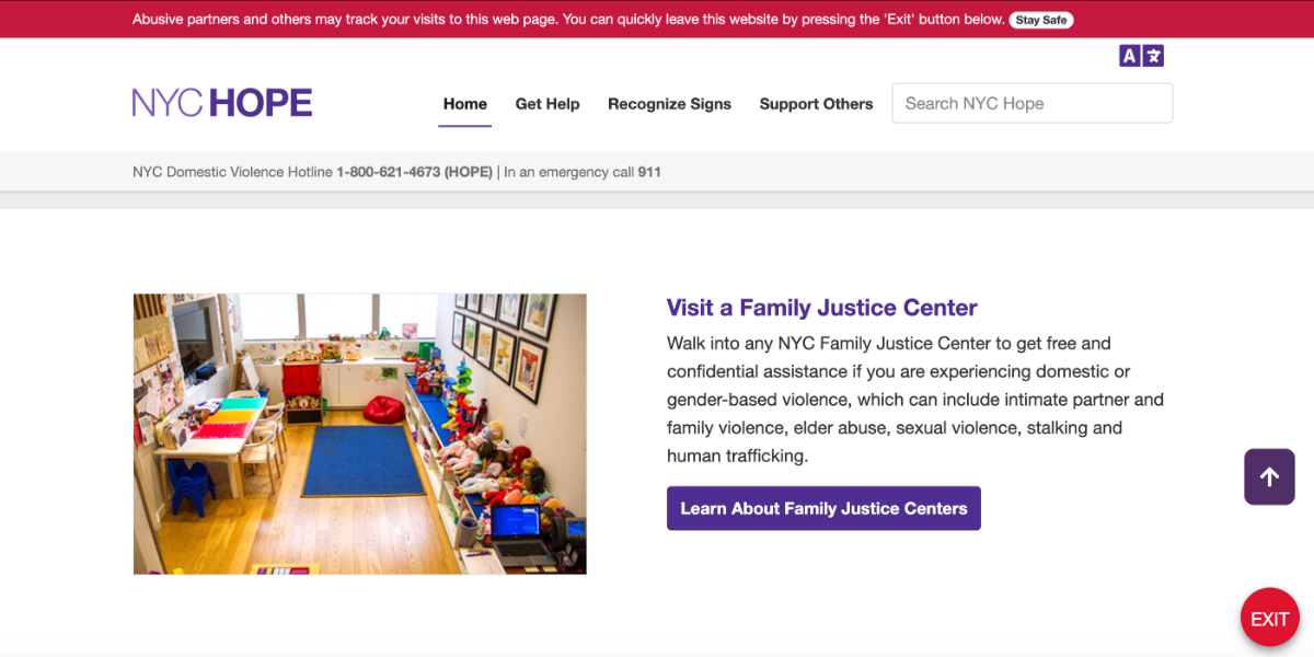
For survivors of domestic and gender-based violence, there are a lot of factors that create obstacles to getting help. The NYC Mayor's Office to End Domestic and Gender-Based Violence (ENDGBV) seeks to remove some of those obstacles through community outreach, education, and policy recommendations. They also directly provide help to survivors at their Family Justice Centers; which are comprehensive service centers located in all five boroughs. They provide legal services, therapy, and resources for survivors with children. In 2017, ENDGBV started a dedicated campaign to raise public awareness about these resources.
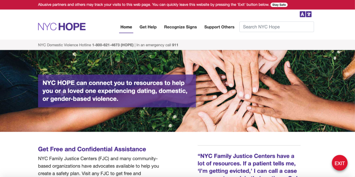
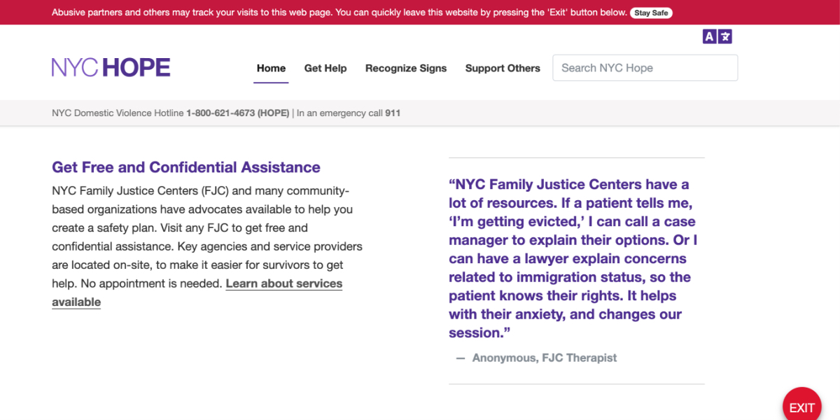
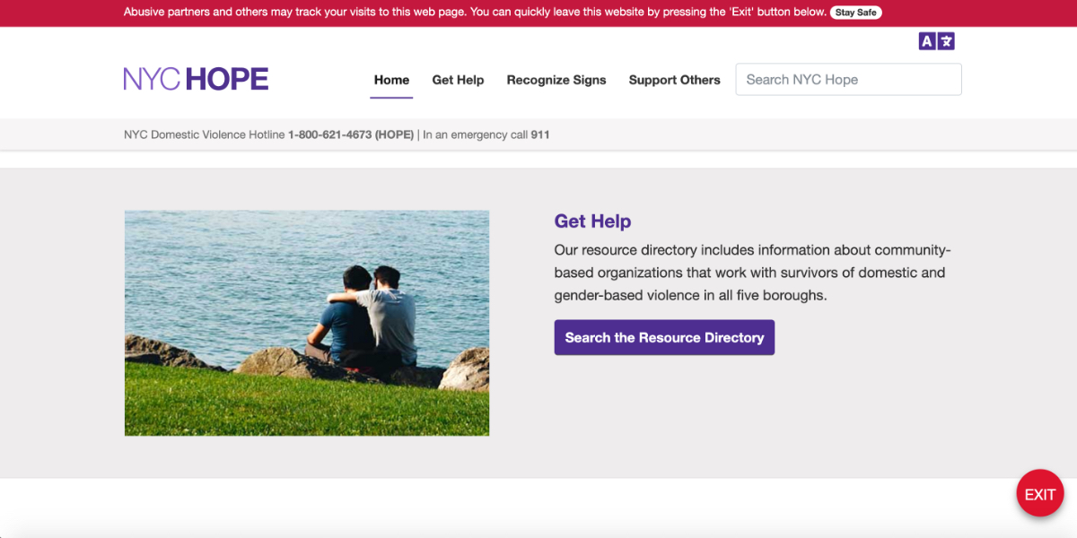
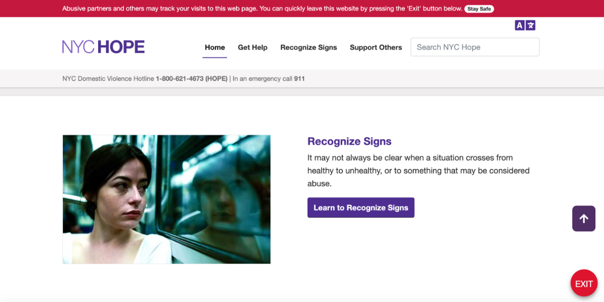
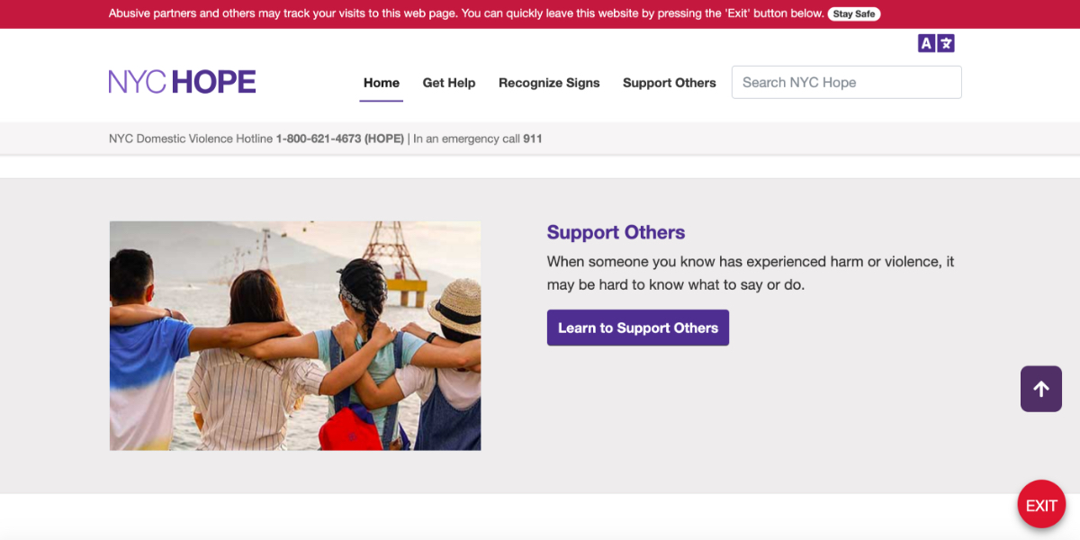
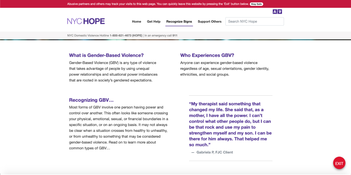
ENDGBV teamed up with the NYC Department of Information Technology and Telecommunications (DOITT) to create a one-stop-shop web presence to educate and help survivors of interpersonal violence in NYC. I was one of two designers on the project. The end result? NYC Hope.
My Role
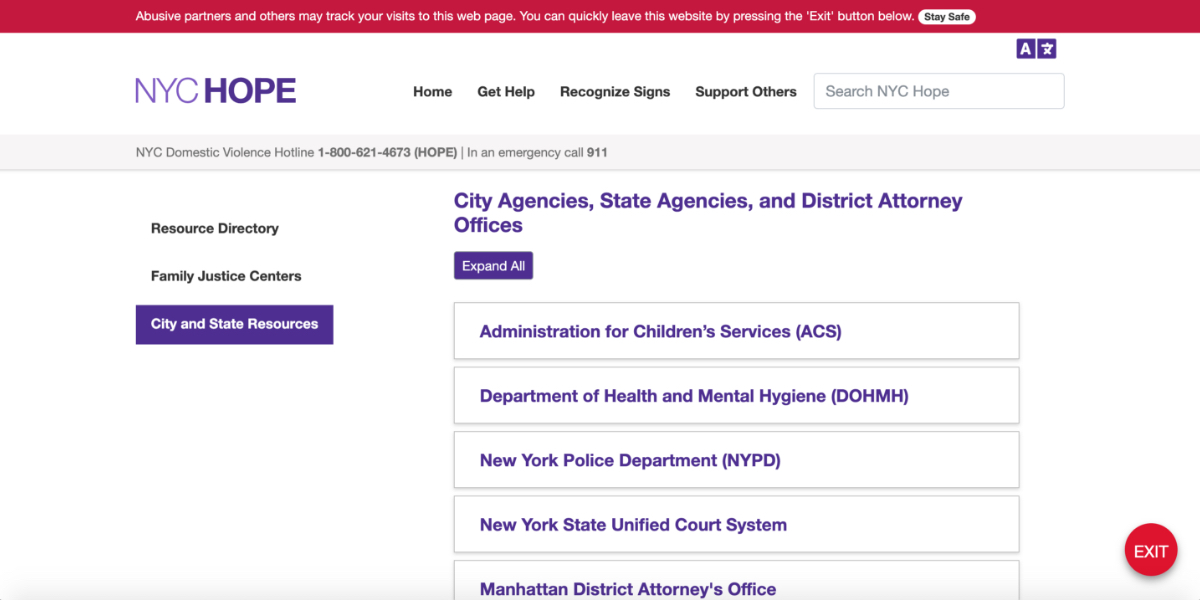
The goals of this project were pretty well defined. ENDGBV wanted to create a website where survivors could get information and also begin the process of getting other kinds of help. The biggest challenge was organizing these resources. As a government agency, ENDGBV provides direct help and education, but it also partners with community-based organizations, like nonprofits, that also provide help to survivors.
My specific challenges were to:
-
determining what, if any, resources users wanted immediately available upfront
-
for all other resources; make searching for them easy, and make those search results easy to understand
-
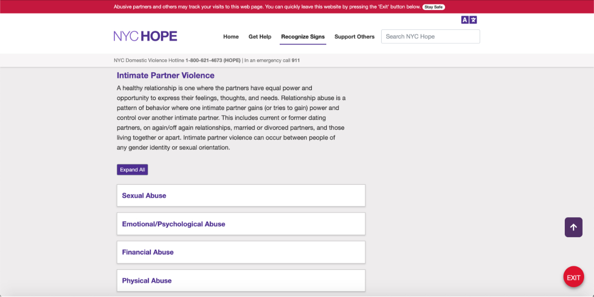
assist with the overall design of the site; with attention being paid to color, typography, content design, responsiveness, and accessibility
-
create wireframes, mockups, prototypes, and production-ready HTML/CSS/JavaScript for front-end developers
-
test early prototypes with real users
The Process
Working directly with ENDGBV meant that we access to subject matter experts, city government personnel working in this space, and most importantly, our users: survivors of intimate partner violence themselves. We were able to organize a series of one-on-one interviews with brave survivors willing to come forward and share their experiences and recommendations.
We were able to take these interviews and synthesize both empathy and customer journey maps, that helped us better understand what users prioritized and expected. One of our biggest findings was somewhat surprising, though maybe it shouldn’t have been: survivors did not care at all whether the resources or information they were looking up came directly from a city government source (like ENDGBV itself) or from the nonprofit space. Help was help, and information was information. Ease of access and clarity were far more important to our users than checking sources.
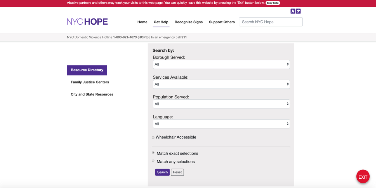
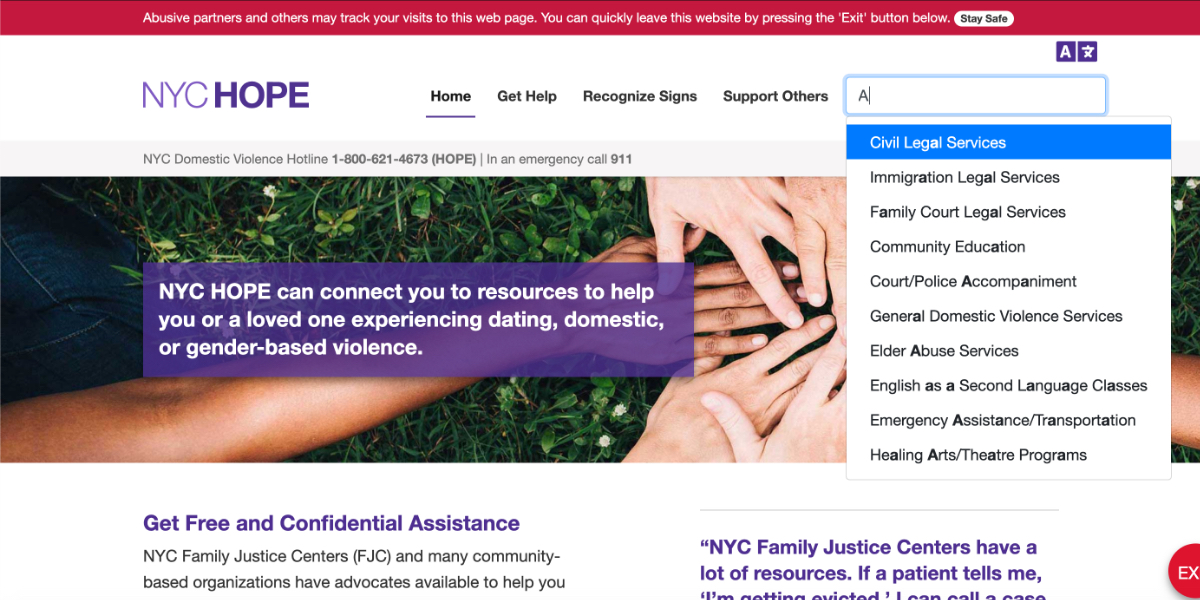
This made me rethink the way we were going about building our search functionality. Rather than organize information and resources based on the source, I decided it was better to simplify searching altogether. We obviously already had each and every organization listed in our community resource directory tagged with unique identifiers, we simply added unique ID tags to all of our content as well.

Now users could type into any search field, and would get results that were both informational content like articles and FAQs and also resources like housing shelters in their neighborhood, regardless of whether either was from a city government source or not. Adding autocomplete increased the simplicity of the process.

Completing a search navigates users to a dedicated search results page, separated between content and resources.

Each individual resource has a dedicated page, which was purposefully designed for ease of reading and ease of printing. Many of our users would only be visiting the site in the safety of a public place like a library.

The resource page is laid out with useful information such as its address, phone number, and what kind of services it provides.

Sample Documentation
Lessons Learned
As a designer your hope is that people view your work and appreciate its aesthetics, usefulness, and intuitiveness. This project taught me that sometimes appreciation can’t be measured in any of the usual ways. We tracked the web traffic trends for the site, and our hope was actually that users came to the site, quickly found the help they were looking for, and then left. A high bounce rate can sometimes be a good thing, and proves that what you’ve built is intuitive enough that people don’t need long to do what they came to do.
This project also had lots of design concerns and constraints that other web projects I've worked on wouldn’t have, because of its intended audience. There were the usual concerns about responsiveness, accessibility, and the like, of course. With survivors of intimate partner violence, we also had to factor in things such as:
-
a large part of our user base spoke a primary language other than English; our content needed to be simple enough to translate seamlessly
-
making sure our color palette and imagery made users feel safe and comfortable
-
the design of the site had to fall within certain city government guidelines, but also not resemble the typical clinical feel of some government websites
-
our interactions had to be simple and obvious enough that even non-tech-savvy users could find their way to important resources quickly
